Mi(美,beauty)D’m(permeate)
MiD’m (Beauty permeates), Beauty that permeates your life.
June 2018,
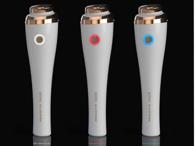
Mid’m was founded to lead a higher level of “Home Beauty” trend, and developed a product to take care of our skin effectively and conveniently at home.
Mid’m has the meaning of “Beauty that permeates your life” with a trustworthy product.
Though we are a young start-up company, each of our member has over 10 years of experience in opportunities and development of medical and beauty products.
Trustworthy product that is made out of new passion and experience on Home Beauty. We will provide you a new amazing experience for your beautiful skin.
Corporate Identity
The logo of Mid’m is patterned directly from the Korean letters of the brand name,“미듬”
The name comes from the Korean word for trust (믿음), and is written down as they sound, which is “Mid’m”.
The figure came from the combined letter “미” and “듬” to form a pattern-like language, and a language-like pattern;
It expresses both the Asian “beauty of blank space” and Western beauty that emphasizes the center.
The two main yellow colors in the logo represents East and West parts of the world, and shows the strong will of Mid’m that like gold, we will not lose our quality even at the center of both worlds. The classic logo type and modernity of our symbol mark contains the co-existence of the past and present, and the degree to which Mid’m is faithful to the proper management.
Mid’m will soar to the bigger future based on the past and present, and will always keep our proper management to grow into the best trustworthy company in the world.
미(아름다움)듬(스며들다)
미듬(美듬, 아름다움이 스며들다, Beauty that permeates your life.)
2018년 6월,
미듬은 아름다운 피부를 집에서 효과적이고 편리하게 관리 할 수 있는 제품을 개발하고 한 차원 높은 Home Beauty 트렌드를 리드 하기 위해 설립 되었습니다.
믿을 수 있는 제품으로 피부에 아름다움이 스며들게 한다는 뜻의 미듬.
젊은 스타트업이지만 미듬의 팀원은 모두 의료, 미용 분야의 기회과 제품 개발에 10년 이상의 경력을 갖고 있는 ‘경험’을 보유한 기업입니다.
Home Beauty에 대한 새로운 열정과 경험으로 믿을 수 있는 제품, 아름다운 피부를 위한 새롭고 놀라운 경험을 선사 해 드리겠습니다.
CI 소개
미듬의 심볼마크는 한글의 문자를 패턴화 하여 브랜드 네임 그대로를 함축하여 형상화 하였다.
믿음이란 단어를 소리나는 대로 풀어 쓴 "미듬"
그 형상은 한글의 "미"와 "듬"을 결합하여 하나의 문양과 같은 언어, 언어와 같은 문양으로 표현 하였고,
동양의 "빈 공간의 아름다움" 여백의 미와, 중심을 강조하는 서양의 미를 같이 함축하고 있다.
주색인 노랑 계열의 2가지 색상은 동.서양을 의미하며, 골드의 변치않는 색상처럼 동과 서양을 넘어 세계 중심에서도 변치않는 퀄리티를 잃지 않는 미듬의 의지를 담아내고 있다.
클래식한 로고 타이프와 심볼마크의 모던함은 과거와 현재의 공존과, 기본에 충실한 미듬의 정도경영을 함께 내포하고 있다.
미듬은 과거와 현재를 바탕으로 앞으로 더 큰 미래를 향해 비상함은 물론, 항상 정도를 잃지 않는 믿음직한 모습으로 세계 초일류 기업으로 성장할 것이다.